I have noticed over the past couple of weeks that the volume of posts to the FlexCoder’s list seemed to be increasing. So, in order to confirm this, I put together [a quick chart that plots the last two years of post volume to FlexCoders broken down by month][2].
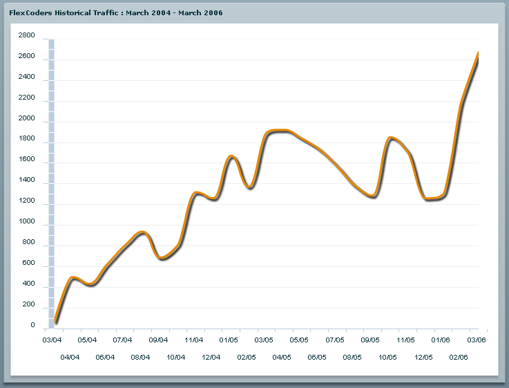
As you can [see][2], it has definitely been trending up, with a pretty sharp rise since the beginning of the year.
You can view the source for the chart here (or just right click on the chart).
You can find more information on the FlexCoder’s list here.